The newspaper feeling,
online.
The most widely read agricultural weekly in Switzerland had a website that worked — but looked less forceful than the journalism behind it.
Functional is not
the same as strong.
The goal was an appearance that carries the newspaper feeling online as well: clearly structured, easy to read, with room for stories, pictures and the sheer volume of material that appears every week.
Alongside that came the technical renewal — a TYPO3 major update, a PHP version change, and improvements in performance and security.
A design to build,
a system to modernise.
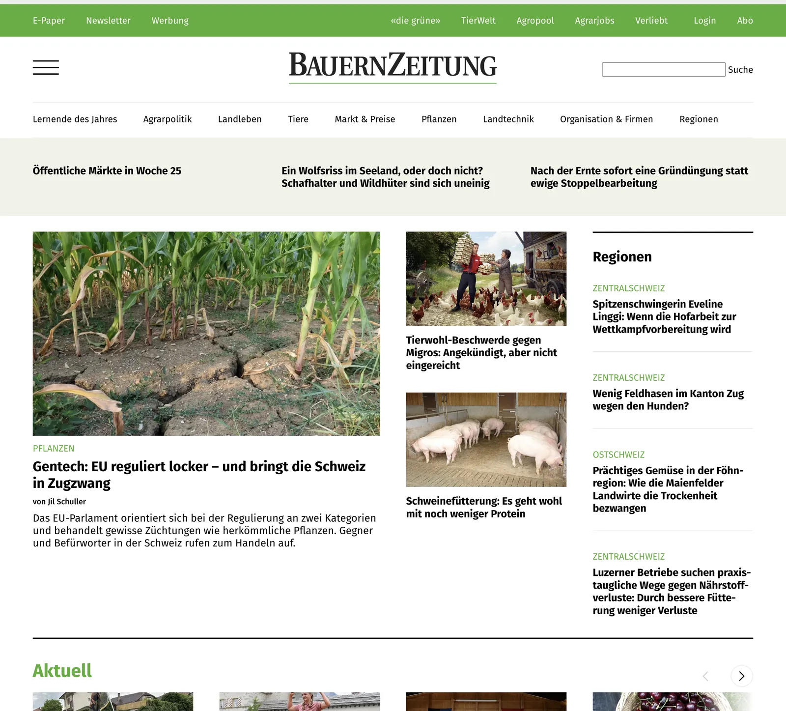
Design by BUERGY
The new design gives the site a distinctly journalistic character: calm typography, a clear hierarchy and a layout structure for the sections — agricultural policy, animals, country life, market and prices, plants, farm technology.
Clean implementation in TYPO3
Our part was the faithful build of that design and the modernisation of the existing system underneath it — two jobs that are easier to do together than one after the other.
Everything existing came along
E-paper, newsletter, dossiers and the AgrarPodcast were carried over — without the newsroom having to relearn how it works. A relaunch that costs the editors a month of confusion has not fully succeeded.
New clothes,
same routine.
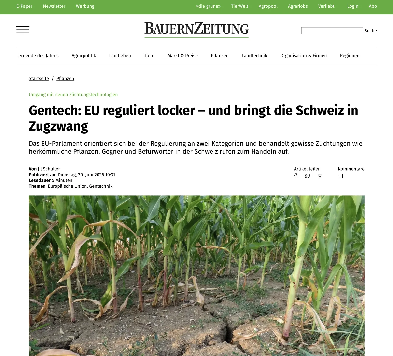
The site now looks like what it is: a weekly newspaper with a lot to say. And the people who fill it every week kept working the way they always had.
BauernZeitung.
Published by Schweizer Agrarmedien AG in Münchenbuchsee, the BauernZeitung reports weekly on agriculture in Switzerland and is the sector's most widely read title.
A design ready and
a system that is not?
Those two usually arrive together. Doing them in one pass is cheaper than doing them in two.
What else
we work on.